Tabulation
• Tabulation is the first step before the data is used for analysis or interpretation.
• A table can be simple or complex, depending upon the number or measurement of single set or multiple sets of items.
• Whether simple or complex, there are certain general principles which should be borne in mind in designing tables:
– The tables should be numbered e.g. Table 1, Table 2 etc.
– A title must be given to each table. The title must be brief and self-explanatory.
– The headings of columns and rows should be clear and concise
– The data must be presented in an order e.g.
• size
• importance;
• chronologically,
• alphabetically or
• geographically
– If percentages or averages are to be compared, they should be placed as close as possible
– No table should be too large
– Most people find a vertical arrangement better than a horizontal one because, it is easier to scan the data from top to bottom than from left t right
– Foot notes may be given where necessary, providing explanatory notes or additional information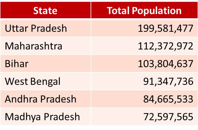
Charts and Diagrams
• The purpose of data presentation through charts and diagrams is to have a quick visual impression
– Readers can easily understand visual presentations since these have a striking visual impact
– Tables tend to be boring and difficult to perceive.
– Graphical presentations convey the essence of the statistical data, circumventing the details
– For this purpose the data presented through diagrams must be simple
– Complicated charts fail to convey the message and beat the purpose of these drawings
– Hence a lot of details of the original data have to be foregone for preparing charts and diagrams
• It is of utmost importance that the visual presentations are produced correctly, using appropriate scales.
– Otherwise distortion of data may occur and
– The resulting visualizations of statistical information can be misleading
– Remember, computers will do what you tell them to do and not what should be done
– It is better to try out the charts and graphs on colleagues first to detect any mis-interpretations
– Graphs, charts and diagrams should be self-explanatory and the reader should be able to understand them without detailed reference to the text
– The title should be informative and
– The axes of graphs should be clearly labelled
– The key should be placed where required
Bar Charts (Bar Graphs)
• A ‘Bar graph’ is a way to visually represent qualitative data.
• They enable visual comparison of frequencies in the categories.
– The length of each bar is proportional to the frequency to be represented. Hence a suitable scale is to be used.
– Bars may be vertical or horizontal.
– All the bars in a graph should be of the same width.
– The bars must be separated by appropriate spaces for clarity
• It has been suggested that the spacing between the bars should be half of the width of the bars
– Bars should preferably be arranged in increasing or decreasing order or in an order that suits the context e.g. Chronological order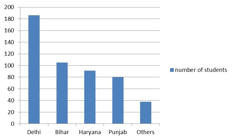
Types of Bar Charts
Three types of bar charts are commonly used:
1. Simple bar chart
2. Multiple bar chart – Two or more bar charts are grouped together
3. Component bar chart (Proportional bar chart): the bars may be subdivided into two or more parts, depending upon
– The number of the subgroups.
– The length of each part is in proportion to its magnitude
• Simple bar chart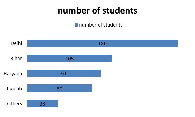
• Multiple bar chart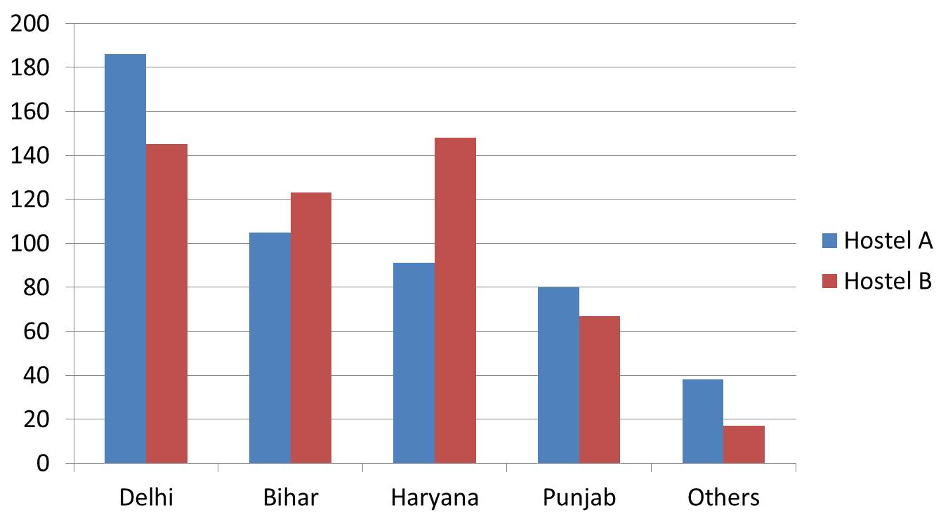
• Component bar chart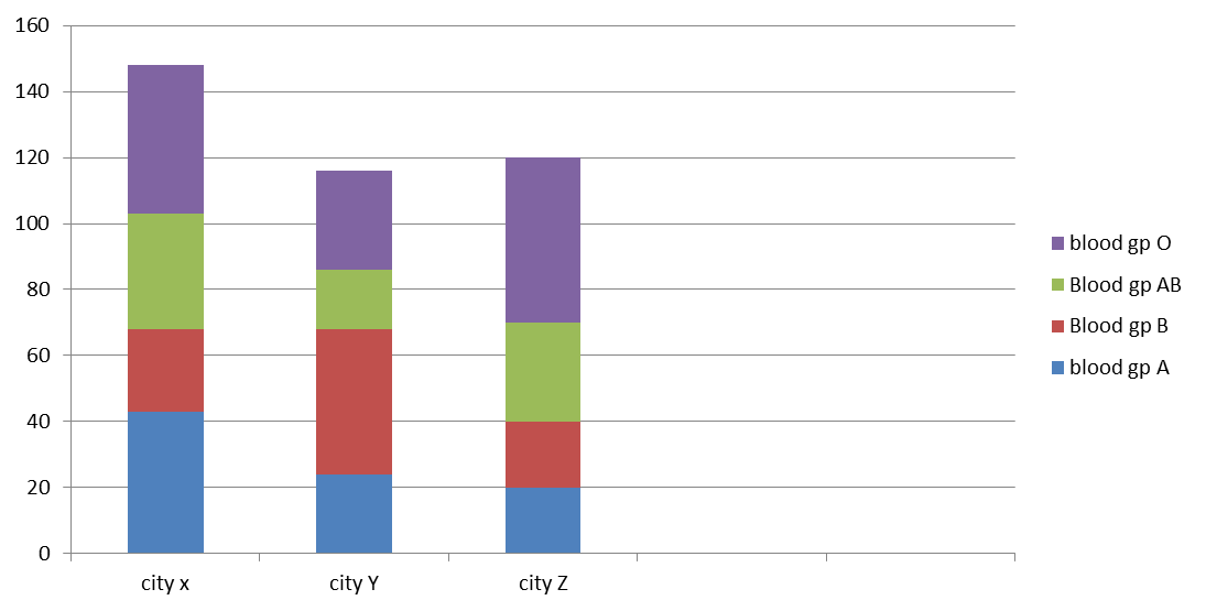
Pie diagram
• It is a diagram in which the frequencies are depicted as sectors of a circle,
• The degrees and hence the size of each sector is proportional to the frequency of the variable.
• The sectors should be arranged clockwise in descending order and
• The respective percentage is depicted on the sectors.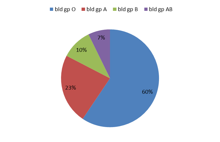
Pie diagram is suitable when:
• The number of categories is small
• The frequency of each group can be added to get the total number of observations (i.e. the responses are mutually exclusive)
Steps of Creating a Pie Diagram
1. Calculate pie chart proportions:
a) Calculate each frequency as proportion of the total (p1, p2 ....pn)
b) Calculate the angle for each pie slice or sector. The formula is p1 X 360⁰, p2 X 360⁰,.....pn X360⁰
2. Draw a circle
3. Draw a radius of the circle
4. Place the protractor on this radius
5. Plot a point on the circle at the first calculated angle
6. Join this with the centre of the circle, the first sector and a new radius is now obtained
7. Place the protractor on this new radius and plot a point on the circle at the next calculated angle
8. Each time you add a section, the radius changes to the line you just drew; rotate the protractor accordingly
9. Color each segment differently and make the color code key
10. Mention the frequencies and percentages on each sector
Pictogram
• Pictograms are a visually engaging way to present information
• These are meant to convey data to the ‘man in the street’ who finds it difficult to comprehend complex charts
• Small pictures or symbols are used to present the data
• The number of pictures is proportional to the frequency size
• One picture depicts a fixed number
• A fraction of a picture can be used to represent a smaller number
• Pictograms are not effective for visualizing large sets of data.
– In this cases, a bar chart is more effective. But for a few simple data series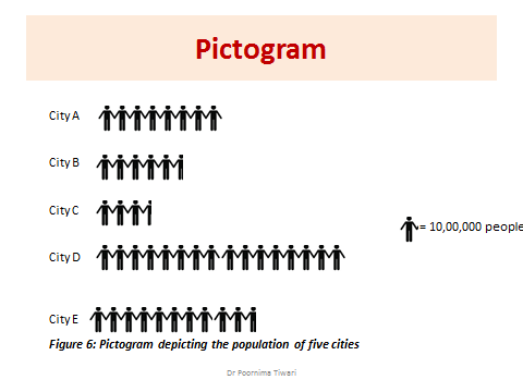
Spot Map
• A map showing the geographic location of people with a specific attribute e.g. cases of an infectious disease
• One dot can depict a fixed number of cases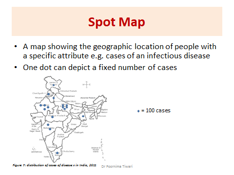
References
• Health information and basic medical statistics: Park’s Textbook of PSM, 23rd ed. 2016
• Methods in Biostatistics: B.K. Mahajan, Jaypee Brothers Medical Publishers
• Informative Presentation of Tables, Graphs and Statistics: University of Reading, Statistical Services Centre. Biometrics Advisory and Support Service to DFID, March 2000
• Making Data Meaningful, A guide to presenting statistics, UNITED NATIONS, Geneva, 2009