Tabulation
• Tabulation is the first step before the data is used for analysis or interpretation.
• A table can be simple or complex, depending upon the number or measurement of single set or multiple sets of items.
• Whether simple or complex, there are certain general principles which should be borne in mind in designing tables:
– The tables should be numbered e.g. Table 1, Table 2 etc.
– A title must be given to each table. The title must be brief and self-explanatory.
– The headings of columns and rows should be clear and concise
– The data must be presented in an order e.g.
• size
• importance;
• chronologically,
• alphabetically or
• geographically
– If percentages or averages are to be compared, they should be placed as close as possible
– No table should be too large
– Most people find a vertical arrangement better than a horizontal one because, it is easier to scan the data from top to bottom than from left t right
– Foot notes may be given where necessary, providing explanatory notes or additional information
• Tabulation of quantitative data is usually more cumbersome since
– the characteristic itself has a magnitude or size which is measurable as well as
– Has the frequency i.e. the number of persons having each measure .e.g. height, weight pulse rate etc.
• In case of quantitative variable, the variable can be divided into class intervals with the frequency mentioned against each class interval (or group interval).
• Frequency will include all persons having that value of the attribute which falls within the range of the class interval.
Calculating class intervals
1. Calculate the range from lowest to the highest value (highest value – lowest value)
2. Divide this range into subranges called as ‘class intervals’ or ‘group intervals’
– The class intervals should be equal
3. The frequency is counted and noted against the ‘class interval’. This is called as the ‘class frequency
– If the upper limit of the class intervals coincides with the lower limit of the next class interval, the person is counted in the upper class or group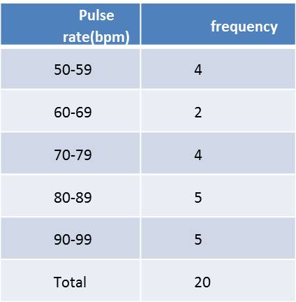
• Rules for Making a Frequency Distribution Table
• The class or group interval between the groups should not be too broad or too narrow.
– Sometimes the class intervals are readymade and may be used as such. E.g. age groups as used by Census of India, family income slabs as given in the ‘modified Kuppuswamy’s classification of Socio – economic status’
– Too large groups will omit the details and
– too small will defeat the purpose of making the data concise
• The number of groups or classes should not be too many or too few
– Customarily, between 6 – 16 classes are optimum
• The class intervals should be equal throughout
• The headings must be clear and the units of data should be mentioned e.g. percent, per thousand, mmHg etc.
• Groups should be presented in ascending or descending order
• The table should be numbered
• The table must have a clear, concise and self – explanatory title
Charts and Diagrams
• The purpose of data presentation through charts and diagrams is to have a quick visual impression
– Readers can easily understand visual presentations since these have a striking visual impact
– Tables tend to be boring and difficult to perceive.
– Graphical presentations convey the essence of the statistical data, circumventing the details
– For this purpose the data presented through diagrams must be simple
– Complicated charts fail to convey the message and beat the purpose of these drawings
– Hence a lot of details of the original data have to be foregone for preparing charts and diagrams
Charts and Diagrams
• It is of utmost importance that the visual presentations are produced correctly, using appropriate scales.
– Otherwise distortion of data may occur and
– The resulting visualizations of statistical information can be misleading
– Remember, computers will do what you tell them to do and not what should be done
– It is better to try out the charts and graphs on colleagues first to detect any mis-interpretations
– Graphs, charts and diagrams should be self-explanatory and the reader should be able to understand them without detailed reference to the text
– The title should be informative and
– The axes of graphs should be clearly labelled
– The key should be placed where required
Histogram
• It is a pictorial diagram of frequency distribution of the quantitative data.
• It consists of a series of rectangular and contiguous blocks.
• The class intervals of the quantitative variable are represented along the horizontal axis (represented by the width of the column) and
• The frequency of each class interval is represented along the vertical axis and is represented by the length of the column.
• The columns are touching each other without space in between (because the class intervals are continuous)
• The AREA of each column depicts the frequency
– Hence in case there is a need to combine the last three intervals
– The width will be three times of the other classes
– The frequency for each fused interval is added up and
– Then divided by 3 to derive the average frequency
– This average frequency is then plotted in the last fused column
– This is done to keep the AREA of the fused column proportionate and representative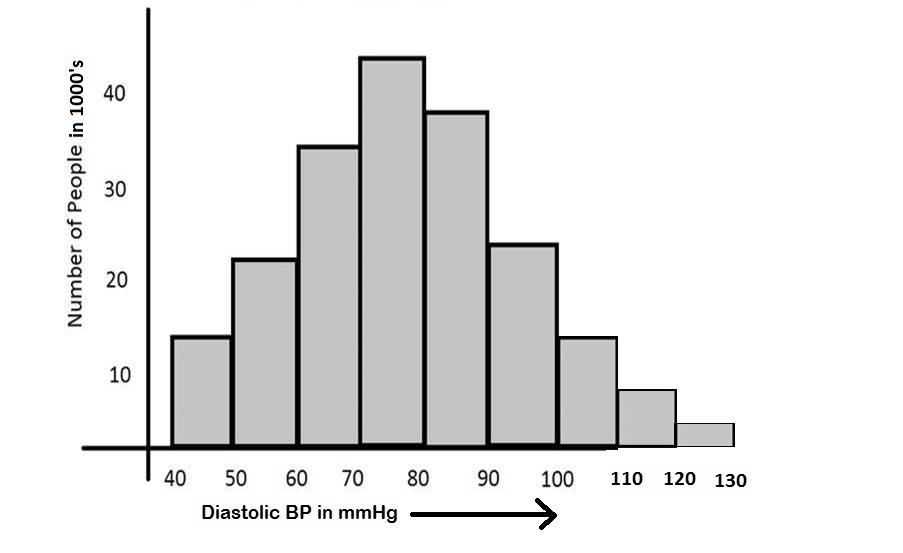
Frequency Polygon
• This also represents the frequency distribution of quantitative data.
• It is obtained by joining the mid-points of the histogram blocks.
• Hence a Frequency polygon is developed over a histogram.
• This can be used when the frequency distribution of different sets of quantitative data need to be illustrated on the same diagram. E.g. birth rates and death rates of some countries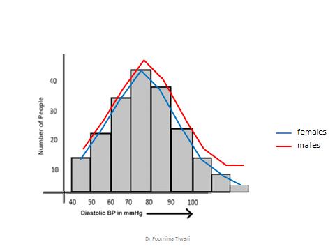
Frequency Curve
• When there are huge number of observations and
• The histogram is constructed using reduced class intervals
• Then, the frequency polygon tends to be less angular and more smooth
• This is known as ‘frequency curve’
• The most known type of frequency curve is the ‘normal curve’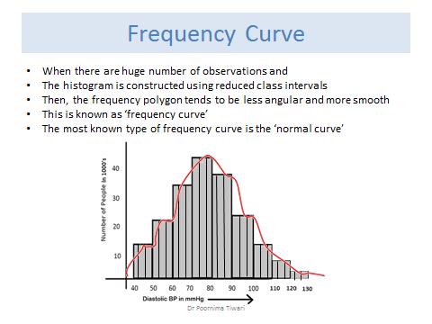
Line Diagram
• Main use is to demonstrate time trend of an event e.g. birth rate, no. of malaria cases, IMR
• This is basically a frequency polygon where the class intervals are in terms of time
• The class interval may be a month, an year, a decade etc. depending on the trend we want to depict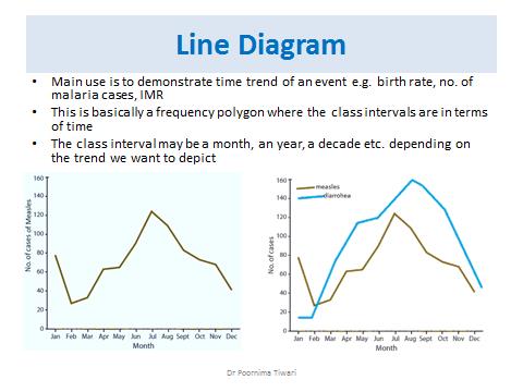
Scatter Diagram
• It is a graphical presentation to show the status of correlation between two quantitative variables
• e.g. the height is plotted on the x axis for a person, the weight of the same person is plotted on the y axis
• A perpendicular drawn from both the points cross each other, a dot is noted at the meeting point
• The above steps are repeated for each subject, we get a set of dots
• If these dots tend to concentrate around a straight line, it indicates a correlation between height and weight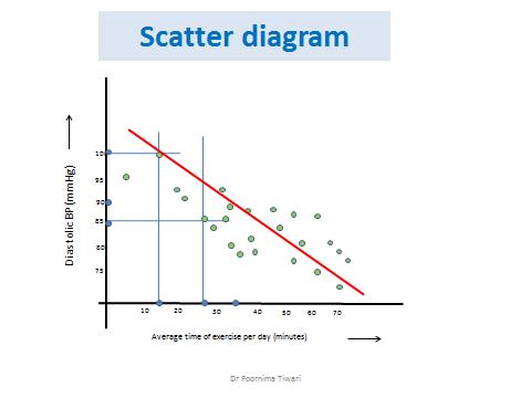
References
• Health information and basic medical statistics: Park’s Textbook of PSM, 23rd ed. 2016
• Methods in Biostatistics: B.K. Mahajan, Jaypee Brothers Medical Publishers
• Informative Presentation of Tables, Graphs and Statistics: University of Reading, Statistical Services Centre. Biometrics Advisory and Support Service to DFID, March 2000
• Making Data Meaningful, A guide to presenting statistics, UNITED NATIONS, Geneva, 2009