• Tabulation is the first step before the data is used for analysis or interpretation.
• A table can be simple or complex, depending upon the number or measurement of single set or multiple sets of items.
• Whether simple or complex, there are certain general principles which should be borne in mind in designing tables:
– The tables should be numbered e.g. Table 1, Table 2 etc.
– A title must be given to each table. The title must be brief and self-explanatory.
– The headings of columns and rows should be clear and concise
– The data must be presented in an order e.g.
• size
• importance;
• chronologically,
• alphabetically or
• geographically
– If percentages or averages are to be compared, they should be placed as close as possible
– No table should be too large
– Most people find a vertical arrangement better than a horizontal one because, it is easier to scan the data from top to bottom than from left t right
– Foot notes may be given where necessary, providing explanatory notes or additional information
• 
Complex table:
• Tabulation of Quantitative Variable
Presentation of quantitative data is usually more cumbersome since
– the characteristic itself has a magnitude or size which is measurable as well as
– Has the frequency i.e. the number of persons having each measure .e.g. height, weight pulse rate etc.
• In case of quantitative variable, the variable can be divided into class intervals with the frequency mentioned against each class interval (or group interval).
• Frequency will include all persons having that value of the attribute which falls within the range of the class interval.
Calculating class intervals
1. Calculate the range from lowest to the highest value (highest value – lowest value)
2. Divide this range into subranges called as ‘class intervals’ or ‘group intervals’
– The class intervals should be equal
3. The frequency is counted and noted against the ‘class interval’. This is called as the ‘class frequency
– If the upper limit of the class intervals coincides with the lower limit of the next class interval, the person is counted in the upper class or group
Rules for Making a Frequency Distribution Table
• The class or group interval between the groups should not be too broad or too narrow.
– Sometimes the class intervals are readymade and may be used as such. E.g. age groups as used by Census of India, family income slabs as given in the ‘modified Kuppuswamy’s classification of Socio – economic status’
– Too large groups will omit the details and
– too small will defeat the purpose of making the data concise
• The number of groups or classes should not be too many or too few
– Customarily, between 6 – 16 classes are optimum
• The class intervals should be equal throughout
• The headings must be clear and the units of data should be mentioned e.g. percent, per thousand, mmHg etc.
• Groups should be presented in ascending or descending order
• The table should be numbered
• The table must have a clear, concise and self – explanatory title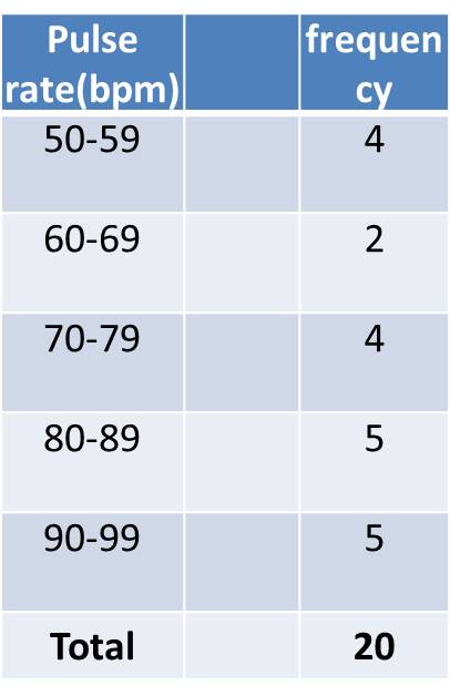
Reference:
• Health information and basic medical statistics: Park’s Textbook of PSM, 23rd ed. 2016
• Methods in Biostatistics: B.K. Mahajan, Jaypee Brothers Medical Publishers
• Informative Presentation of Tables, Graphs and Statistics: University of Reading, Statistical Services Centre. Biometrics Advisory and Support Service to DFID, March 2000
• Making Data Meaningful, A guide to presenting statistics, UNITED NATIONS, Geneva, 2009