Bar Charts or Bar Graphs
- A ‘Bar graph’ is a way to visually represent qualitative data.
- They enable visual comparison of frequencies in the categories.
- The length of each bar is proportional to the frequency to be represented. Hence a suitable scale is to be used.
- Bars may be vertical or horizontal.
- All the bars in a graph should be of the same width.
- The bars must be separated by appropriate spaces for clarity
- It has been suggested that the spacing between the bars should be half of the width of the bars
- Bars should preferably be arranged in increasing or decreasing order or in an order that suits the context e.g. Chronological order
- Types of Bar Charts
Three types of bar charts are commonly used:
- Simple bar chart
- Multiple (Compound) bar chart – Two or more bar charts are grouped together
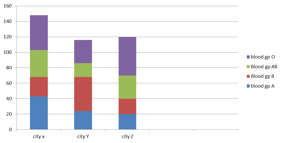
- Component bar chart (Proportional bar chart): the bars may be subdivided into two or more parts, depending upon
- The number of the subgroups.
- The length of each part is in proportion to its magnitude
Figure 1: Bar diagram showing the place of origin of 500 hostellers
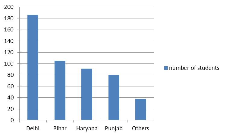
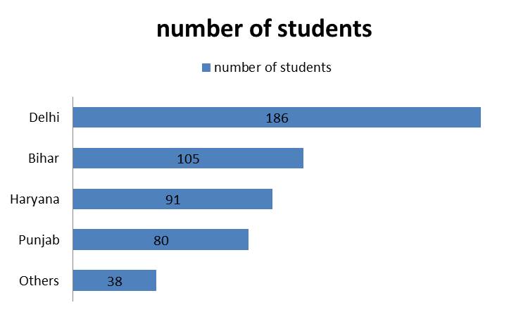
Figure 2: Multiple Bar diagram showing the places of origin of 500 hostellers each in Hostels A and B
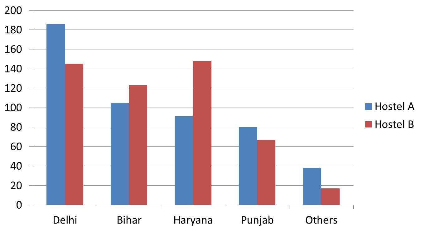
Figure 3: Proportional Bar diagram showing distribution of blood groups in samples from different cities